Movietime Website
Movietime is a movie ticket-buying website, created to accompany the Movietime app. The website creates a streamlined and convenient experience for browsing movies and buying tickets.
Responsibilities:
Conducting user research, paper and digital wireframing, low and high fidelty prototyping
My role:
Lead UX Designer, Lead UX Researcher
I wanted to be strategic about the layout of the Movietime website– ticketing websites need to display a lot of information, and I didn’t want users to be confused or overwhelmed by the layout.
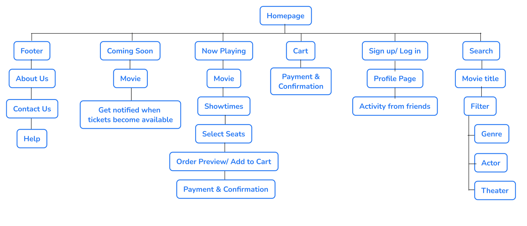
Sitemap
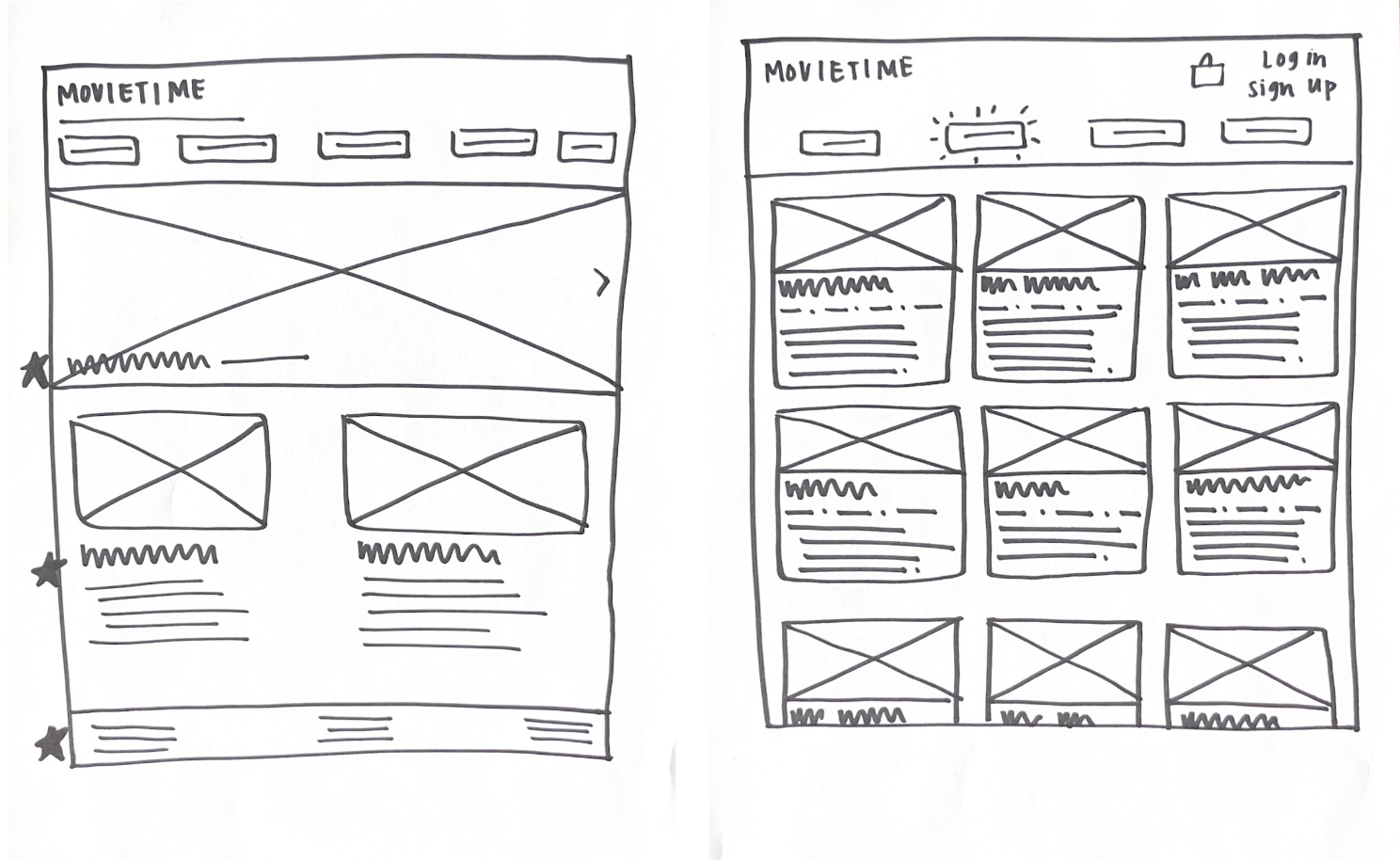
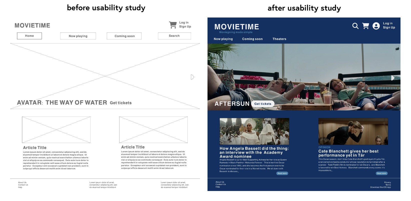
In my initial wireframes, I prioritized a layout that emphasized big pictures– I wanted Movietime to feel like experiencing a movie on the big screen.
Paper wireframes
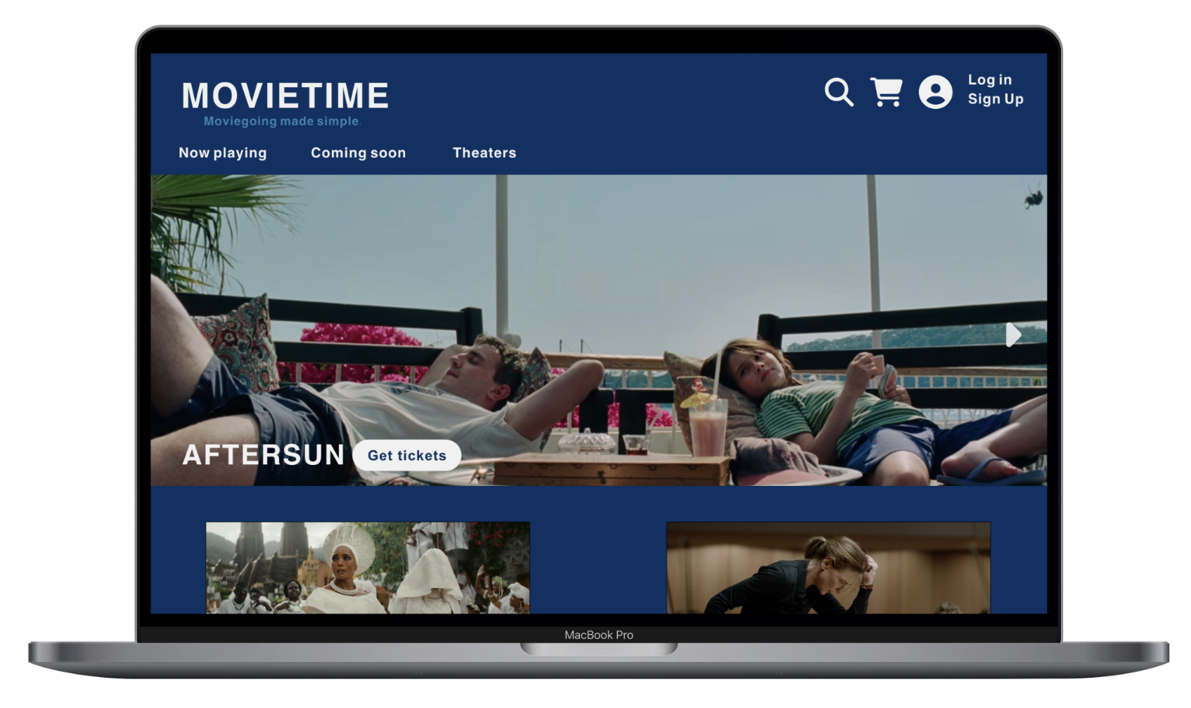
Having a visually interesting homepage was important to me, so Movietime’s homepage features a large carousel of images from current movies.
Digital wireframes
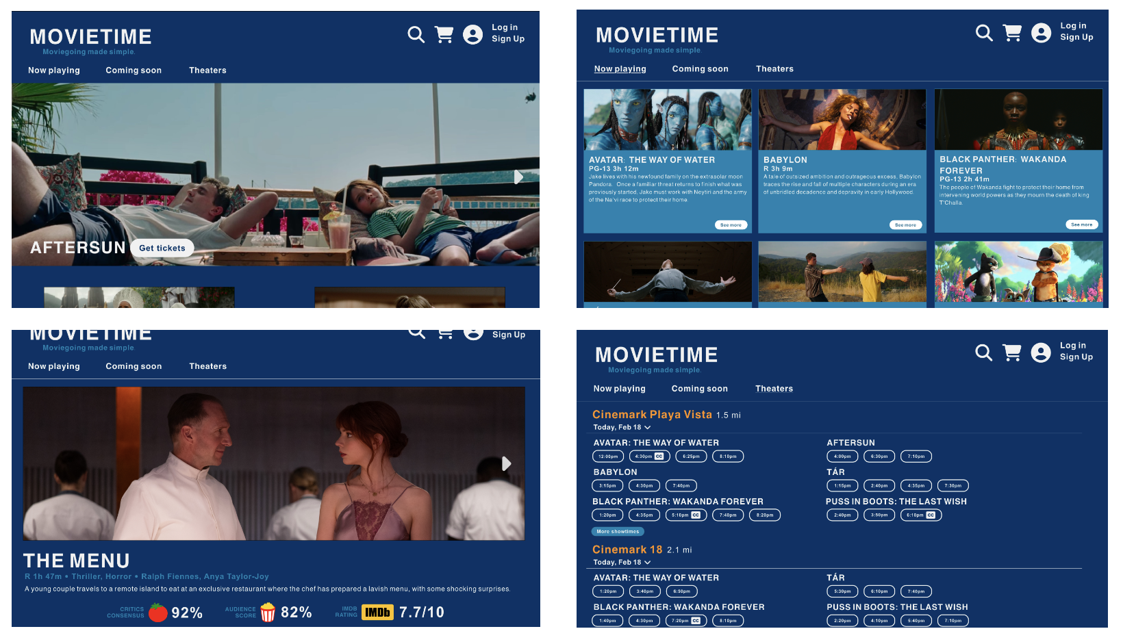
The ‘deck of cards’ layout on the Now Playing page allows users to scroll and quickly find the movie they’re searching for.
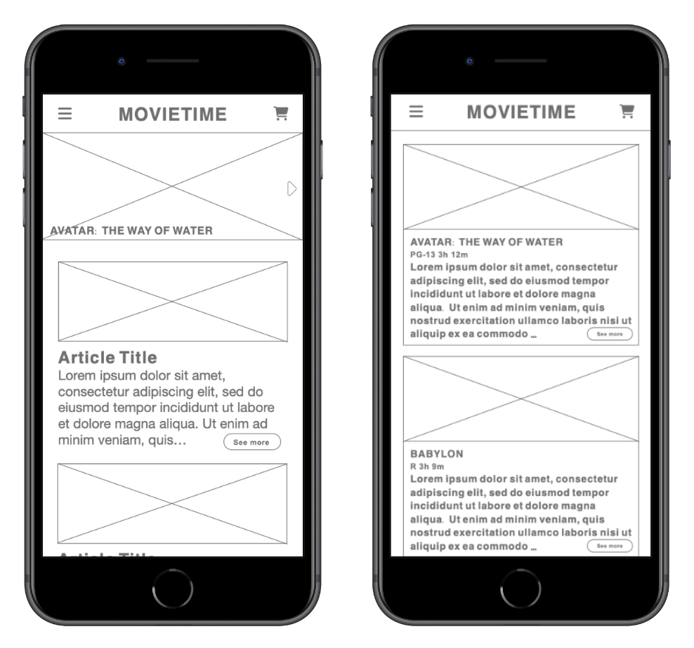
Feedback from users revealed that users’ first instinct is often to scroll, so my iPhone sized digital wireframes allowed users to easily scroll through movies.
Screen size variations
Findings
Users would like some kind of critical rating displayed on the movie’s About page.
Create a ‘Theaters’ tab for users who are interested in which movies are playing at a particular theater.
Display actors’ names on the movie’s About page.
Parameters
I conducted an in-person moderated usability study with five participants between the ages of 18-65.
Participants were prompted to explore the low fidelity prototype, and then asked questions about their experience.
Usability study
It was important that Movietime’s website design was reminiscent of the app, while still being unique. I kept the dark blue background, which made the images really pop.
Mockups
High fidelity prototype
My high fidelity prototype connected several screens to create a functional user flow.
View the high fidelity prototype here.
Font size is never smaller than 16pt, making the text easy to view for all users.
Showtimes display which showings are subtitled by using the closed captioning (CC) symbol.
Most of the text is high contrast (white on a dark background), making it easy for users to read visual cues and navigate the website.
