Movietime App
Movietime is a movie ticket-buying and movie reviewing app. Movietime combines the convenience and streamlined experience of a great movie ticket app with the connectivity and fun of social media, allowing users to buy movie tickets and afterward, leave reviews for their friends to see.
My role:
Lead UX Designer, Lead UX Researcher
Responsibilities:
Conducting competitive audits, conducting user research, paper and digital wireframing, low and high fidelity prototyping
Initial user research & personas
During my initial user research, I asked people about their current methods of movie ticket-buying. I found that most users find popular ticketing apps to be visually unappealing and inefficient, and users often have to search the Internet for help choosing a movie to watch.
Afterward, I created personas to help me understand the needs of potential Movietime users.
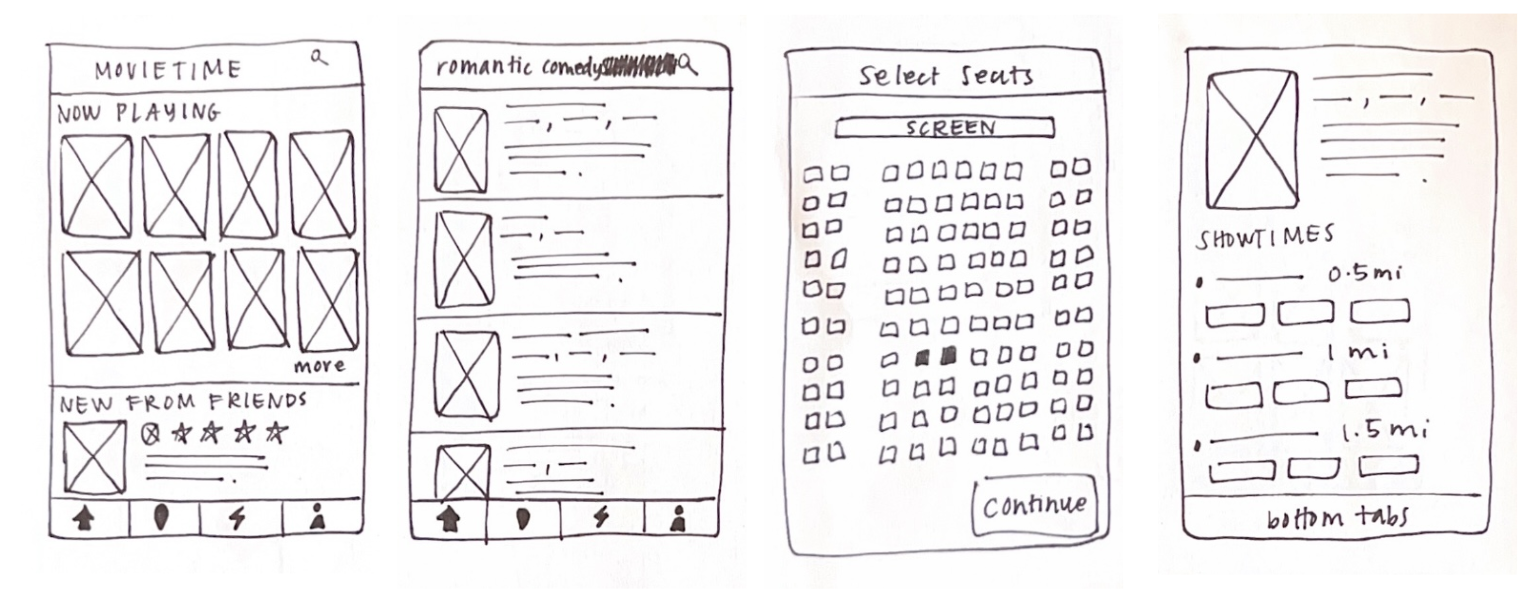
When I was sketching the initial wireframes for the Movietime app, it was important to prioritize a minimalistic and easy-to-understand layout.
Paper wireframes
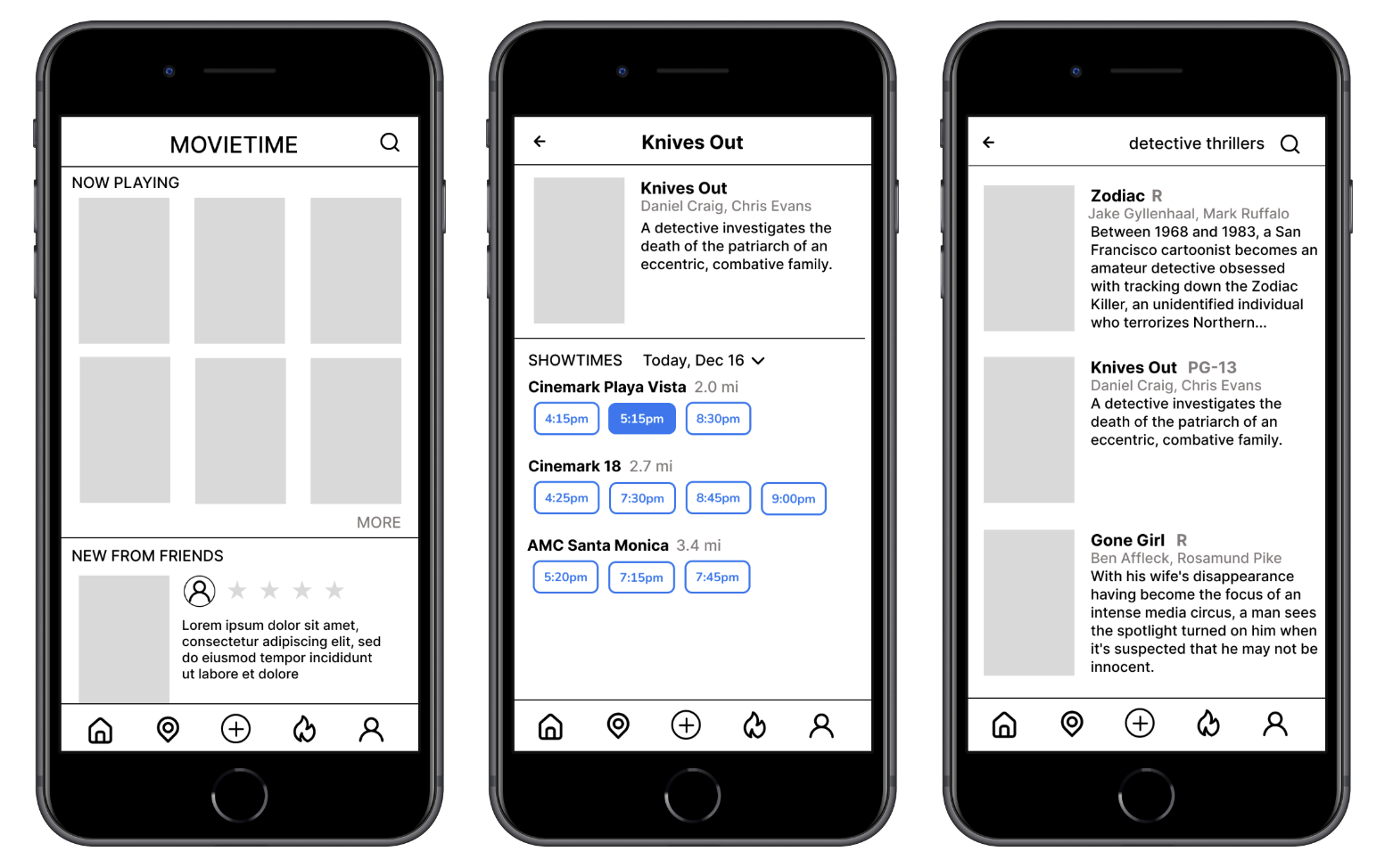
Digital wireframes
The social aspect of Movietime makes the app engaging for users.
The ability to search and learn about new movies through the app removes the need to use the Internet to research movies.
Low fidelity prototype
The low fidelity Movietime prototype connected the primary user flow of choosing a movie and buying a ticket.
View the low fidelity prototype here.
I conducted two rounds of moderated usability studies. Findings from the first study helped transform my low fidelity prototypes into high fidelity prototypes, and the second usability study helped me iterate on my high fidelity designs and create the final Movietime app prototype.
Usability studies
Study 1 findings
Payment screen needs to include more payment options
Home screen needs to be simplified
Users need a straightforward seating map with a legend
Study 2 findings
The seating map needs a more intuitive design
Users need a way for digital tickets to be accessed after purchase
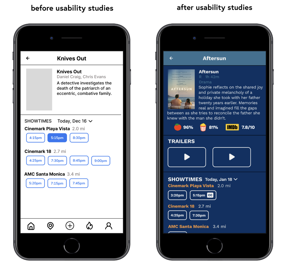
Users would benefit from movie genre being displayed on ‘About’ page
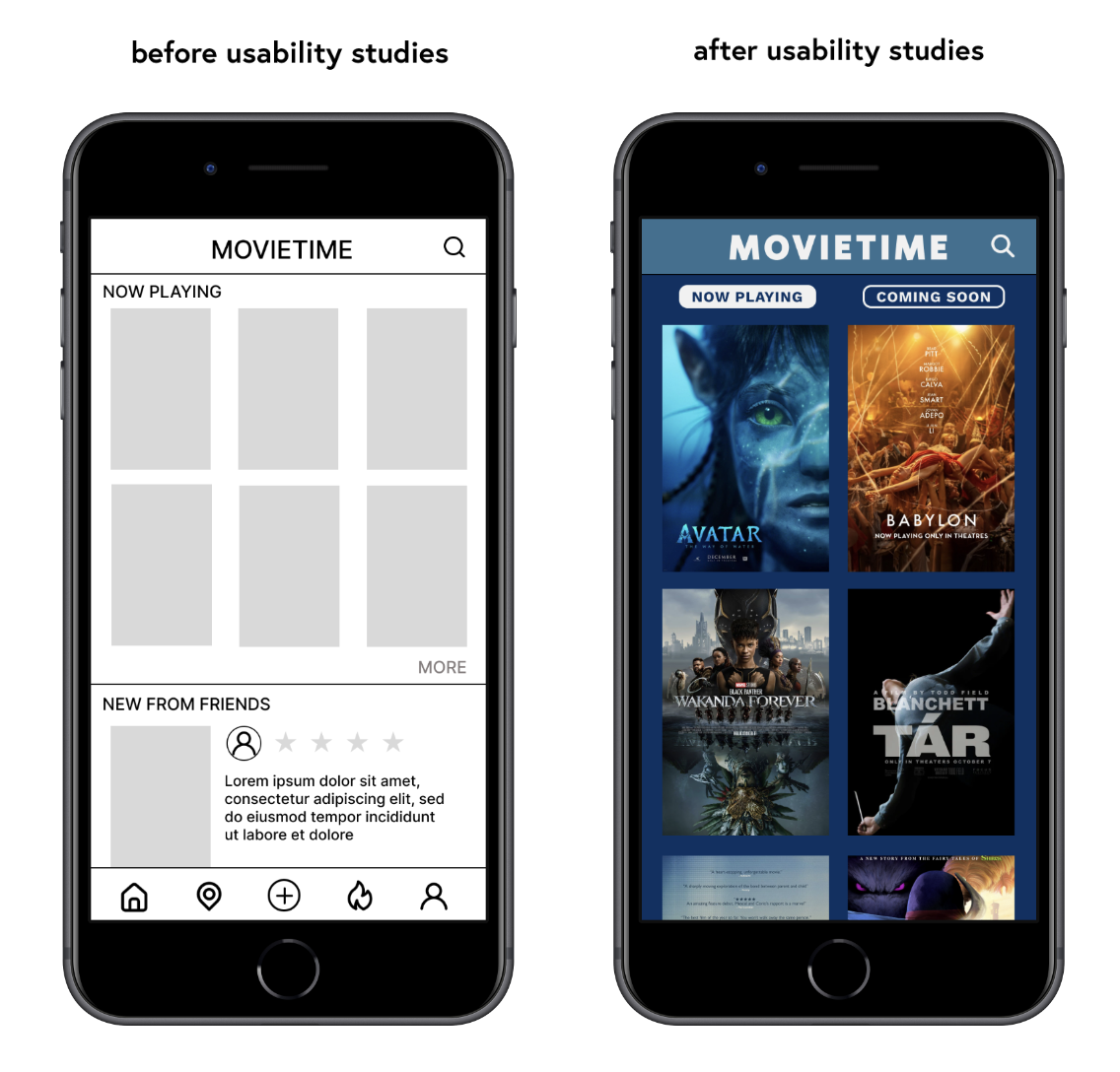
After conducting usability studies, I decided to simplify Movietime’s homepage. Now if users want to see activity from friends, they can visit the ‘Activity’ tab on the navigation bar.
Mockups
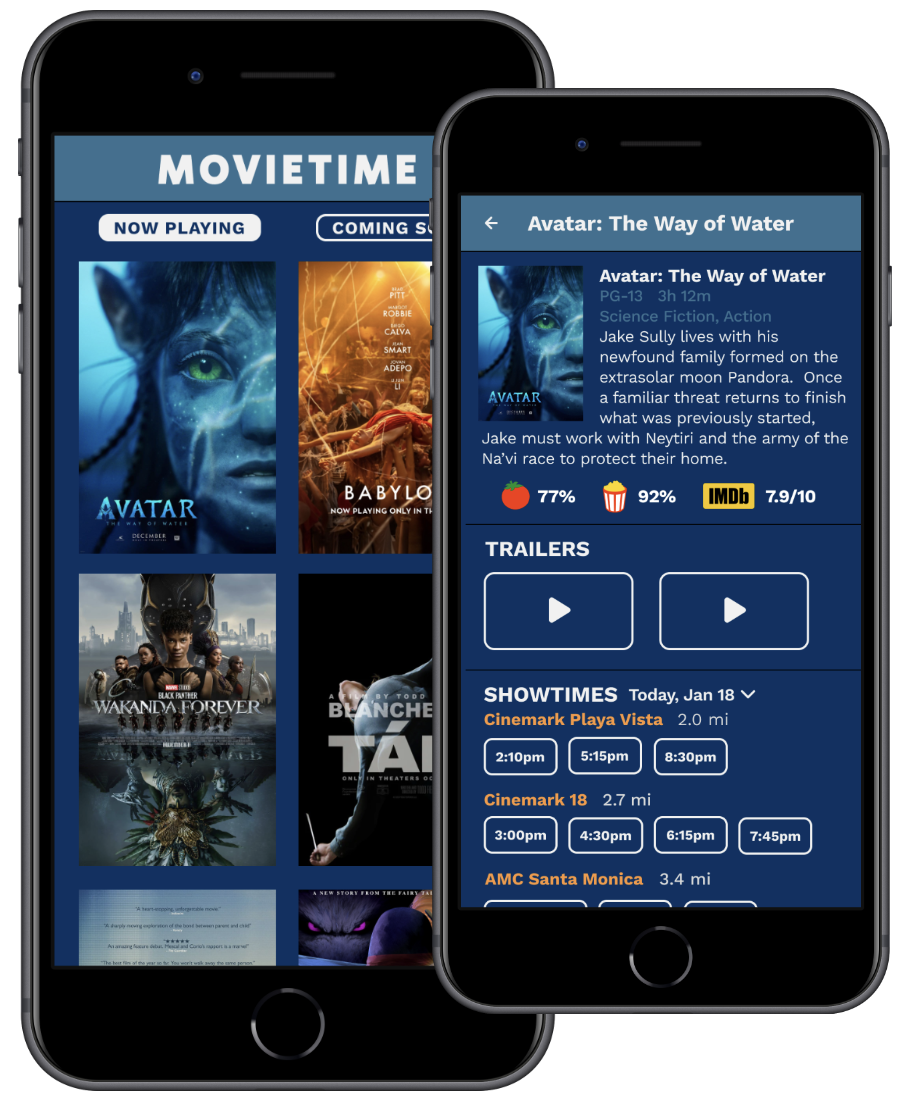
Usability studies helped me identify which pieces of information should be displayed on these ‘About’ pages. I included longer synopses, genre, MPAA rating, runtime, and Rotten Tomatoes ratings to help users decide which movie to watch.
More mockups
High fidelity prototype
The final high fidelity Movietime prototype allows users to browse a wide selection of movies, reserve seats, buy a ticket, leave a review, and look at reviews from friends.
View the high fidelity prototype here.
Accessibility considerations
Almost all of the text on Movietime is white text on a dark blue background, which increases contrast and readability.
Microphone icon allows users to use speech-to-text when leaving a review.
The showtimes section displays which showings are subtitled, using a closed captioning (CC) symbol.
