Sweet Pea
Sweet Pea is a digital resource for parents and kids that aims to help children learn about nutrition in a healthy, non-restrictive way.
My role:
Lead UX Designer, Lead UX Researcher
Responsibilities:
Conducting competitive audits, paper and digital wireframing, low and high fidelty prototyping, conducting user research
Personas & competitive audit
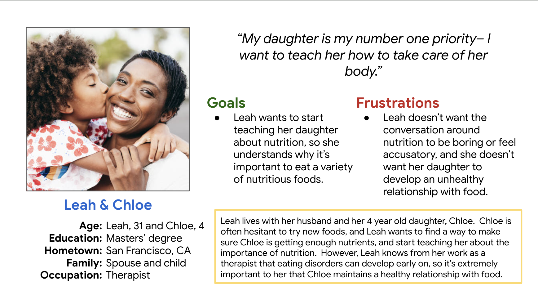
During the initial research stage, I created personas to better understand potential users. I also conducted a competitive audit of similar nutrition services and was able to identify several opportunities for improvement that I could translate into my own designs. View the full competitive audit here.
These are some of the initial sketches I created during the ideation process for the Sweet Pea website. It was important to keep the layout simple enough that a child could navigate it, while still being informational.
Ideation
I wanted the app’s Home page to have a striking visual element that would be easy for children to conceptualize. It was also important to not let the homepage become cluttered with information.
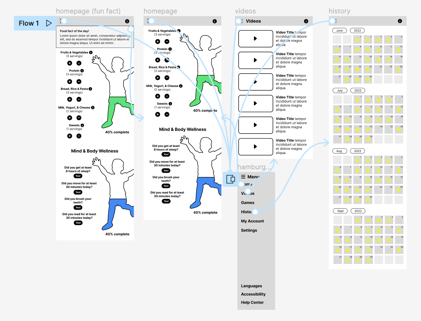
Digital wireframes
Serving-based tracking and lots of ‘information’ icons to give more details about what a serving is, what a protein is, etc.
Running child outline serves as a visual representation of daily progress.
Low fidelity prototype
To prepare for usability testing, I created a low fidelity prototype that connected the most important screens of the Sweet Pea app.
Usability study
I conducted an in-person moderated usability study with five participants between the ages of 18-65.
Participants were prompted to explore the low fidelity prototype, and then asked questions about their experience.
Parameters
Users thought that there wasn’t enough explanation about the app’s purpose.
Users thought that the app prototype didn’t have enough interactive features.
Users thought that the app might not be colorful and engaging enough for children.
Findings
Mockups
One of the most important parts of creating the initial mockups for Sweet Pea was strategically using color and typography so that the app would be more engaging for children, and more pleasing to look at.
More mockups
During the usability study I learned that users weren’t clear about the app’s purpose— they felt like they were thrown into the Home page without much information. So I expanded the user flow to include some preliminary information about what the Sweet Pea app does.
High fidelity prototype
The high fidelity Sweet Pea prototype followed the same user flow as the low fidelity prototype, and it was expanded to accommodate user feedback gained through the usability study. View the high fidelity prototype here.
Most of the text is highly contrasted with its background, making it easy to read.
Sweet Pea has ‘Accessibility’ and ‘Languages’ tabs in the hamburger menu so users can adjust their preferred languages and accessibility settings.
Text on the app and website is written in plain English, making it easy to understand for children or for people who may not speak English as their first language.
Accessibility
Responsive designs
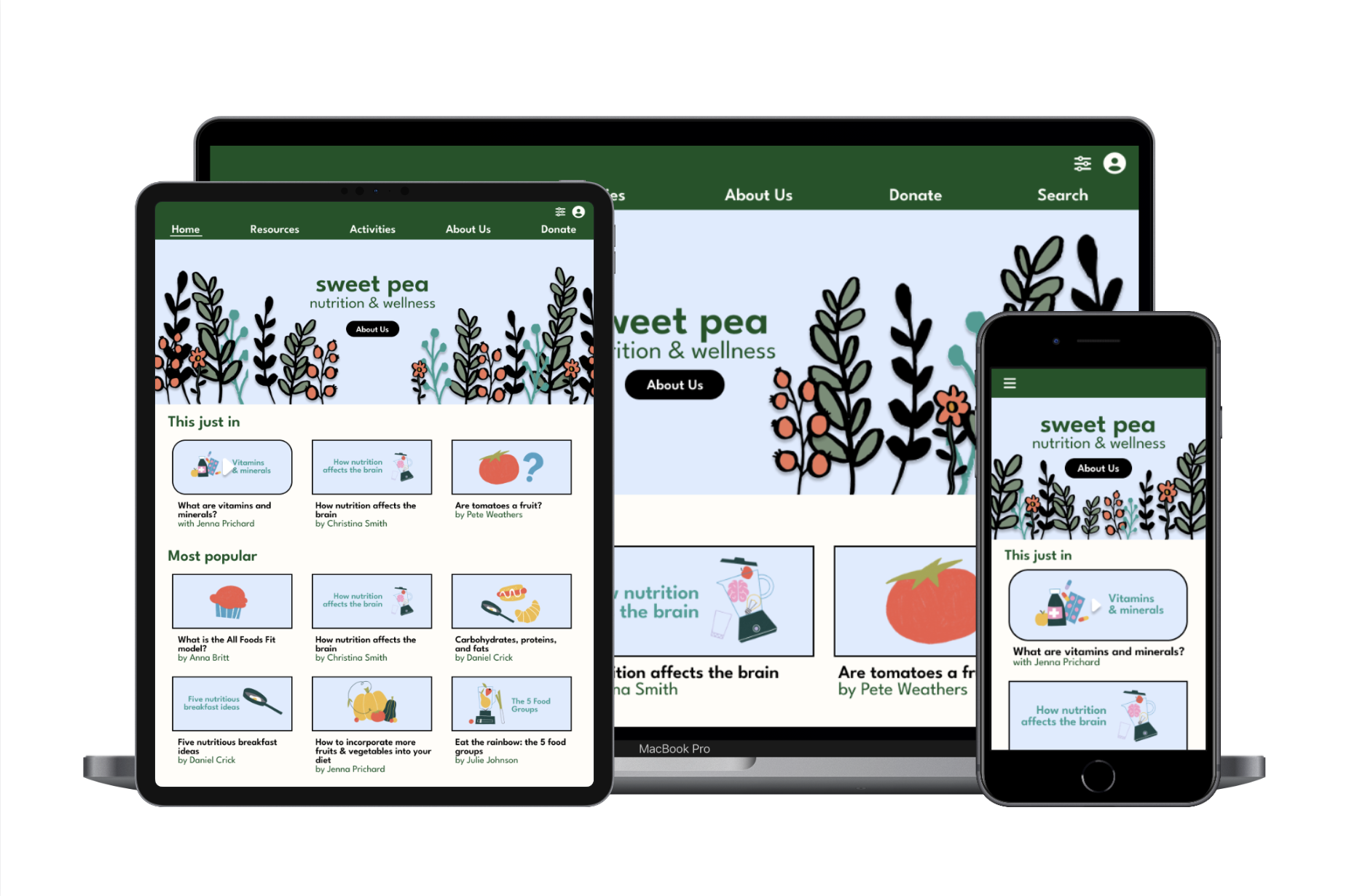
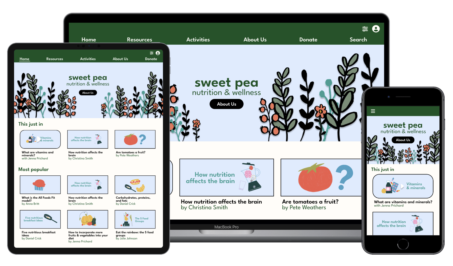
I designed different versions of the Sweet Pea website in order to optimize user experiences on a variety of devices.


